
This is something I’ve wanted to do for a while. We’re going to take a brand theme (also known as a brand anthem) and see what’s going on under the hood. We’ll look at the concept, the methodology, instrumentation, as well as the textures and timbres, and how they all culminate to the audio logo.
This is one we recently did for Northern Latitudes. I got really excited during our initial discussions because it had the kind of themes a sonic brand designer can really sink their teeth into. Northern Latitudes is all about the exploration, beauty, and adventure of the Canadian outdoors. But there are a few ways you can take that. We knew we didn’t want to do the over-the-top approach to adventure with people jumping out of helicopters with skis on. We wanted to create a sense of space and wonder. We wanted to convey the idea that hiking can be just as gratifying as skydiving.
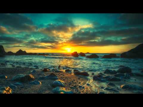
We also needed some versatility. Not only would this theme be applied to podcasts, videos, and other media, but it needed to work in both summer and winter. Fortunately this wasn’t hard. Northern Latitudes’ media feature a wealth of beautiful and unique images of the Canadian landscape. Any time I felt I had hit a creative wall, the images would set me right back on track. In fact many elements of the theme were composed while just going through their media. This was also unique in that melody almost came second to production. We used nearly every trick in the book to create a sense of space and three-dimensional depth.

There are several layers to this piece. Let’s start at the bottom and work our way up.
As much as I like funky bass, this was not the place for it. The low end of our piece is a simple synth drone. We wanted something steady and heavy to represent the Earth.
Next up is the surface. Here we need something that’s going to ground us. For this we look no further than the acoustic guitar. Here we’ve got two performances of the same guitar part, with two synth guitars slipped in there to give just a bit of added sheen. They’re each hard-panned left and right to create a bit of space.
Now we get into the fun stuff. Once we get off the ground we get trees, we get mountains, we get cliffs. This is a great example of melody running second to timbre. Basically I just wanted a conveyance for the echo to create imagery and space. This is a kalimba. They’re very natural sounding, plus they stand out without overstaying their welcome.
Then we need some sky. I really love this synth sound. It just kind of soars over everything else. You can almost picture timelapse footage of clouds passing overhead.
Percussion is kept as simple and natural as possible. Again, we don’t need to be over-the-top. We just want to use natural timbres to glue everything together and give it a nice pulse. Crescendos are also really good at creating a sense of openness.
Of course you’ll hear a few other sonic embellishments in there too, but let’s move on to the pièce de résistance: the logo!
First we start with a melody. Melodies can be tricky in audio branding because you have to delay creative inspiration a bit. As Steve Keller puts it, we blend sound science with sound art to make sound decisions. We base certain decisions on what we know from testing and research, and what we know of the brand. In sonic branding, part of what you do is scientific and calculated, and part of what you do is chaotic and intuitive. It’s a constant exercise in balancing the two, so we want to set some parameters before we start going wild with melodies. For example, we know from testing that slightly longer melodies create stronger recall, so I gave myself six notes to work with. I also decided that keeping with the theme of space and wonder, I wanted the melody to feel slightly unresolved. Here’s the melody in its simplest form.
Again, it’s just slightly unresolved. Listen to what happens when we change just the last note to make the piece sound more resolved. That one note is only going up a semitone.
Big difference, right? It’s the smallest change but it completely changes the feel of the melody. Almost sounds like McDonald’s.
So now that we’ve got our melody, we focus on timbre. Again, this is all about creating space. I kept coming back to the opening of Marooned by Pink Floyd. I’m not even sure if it’s a synth or a guitar or a combination of the two, but just those few opening notes are so spacial and evocative. I knew I wanted to create something similar.
The final audio logo is comprised of about a dozen instruments including guitars, strings, percussion, and synths.
And now that we’ve picked apart the pieces, the concept, and the methodology, let’s have a listen to the final piece.
